Cytkit | Honeychrome
 Honeychrome
- Overview and Installation
- Acquire Data
- Spectral Analysis
- AutoSpectral in Honeychrome
- Conventional Analysis
- Manipulate Plots and Gates
- Reports, Exports & Sample Comparison
- Programming and Plugins
How to manipulate plots and gates in Honeychrome
This guide assumes you have already installed Honeychrome using the executable installers (Windows/Mac/Linux) or Python (cross-platform), and that you have followed at least one of the following examples, so that you can see some unmixed data in the Unmixed Data tab.
1D and 2D histograms and ribbon plots
Honeychrome allows plotting of 1D histograms, 2D histograms (which can also be shown as dotplots coloured by gate, see below), and ribbon plots, which is the full set of 1D histograms in all channels. Click on a plot to select it. You will see a “+” icon on the menu bar to add a plot and a “x” icon to delete the current plot (if one is selected), also the button to toggle gating hierarchy.
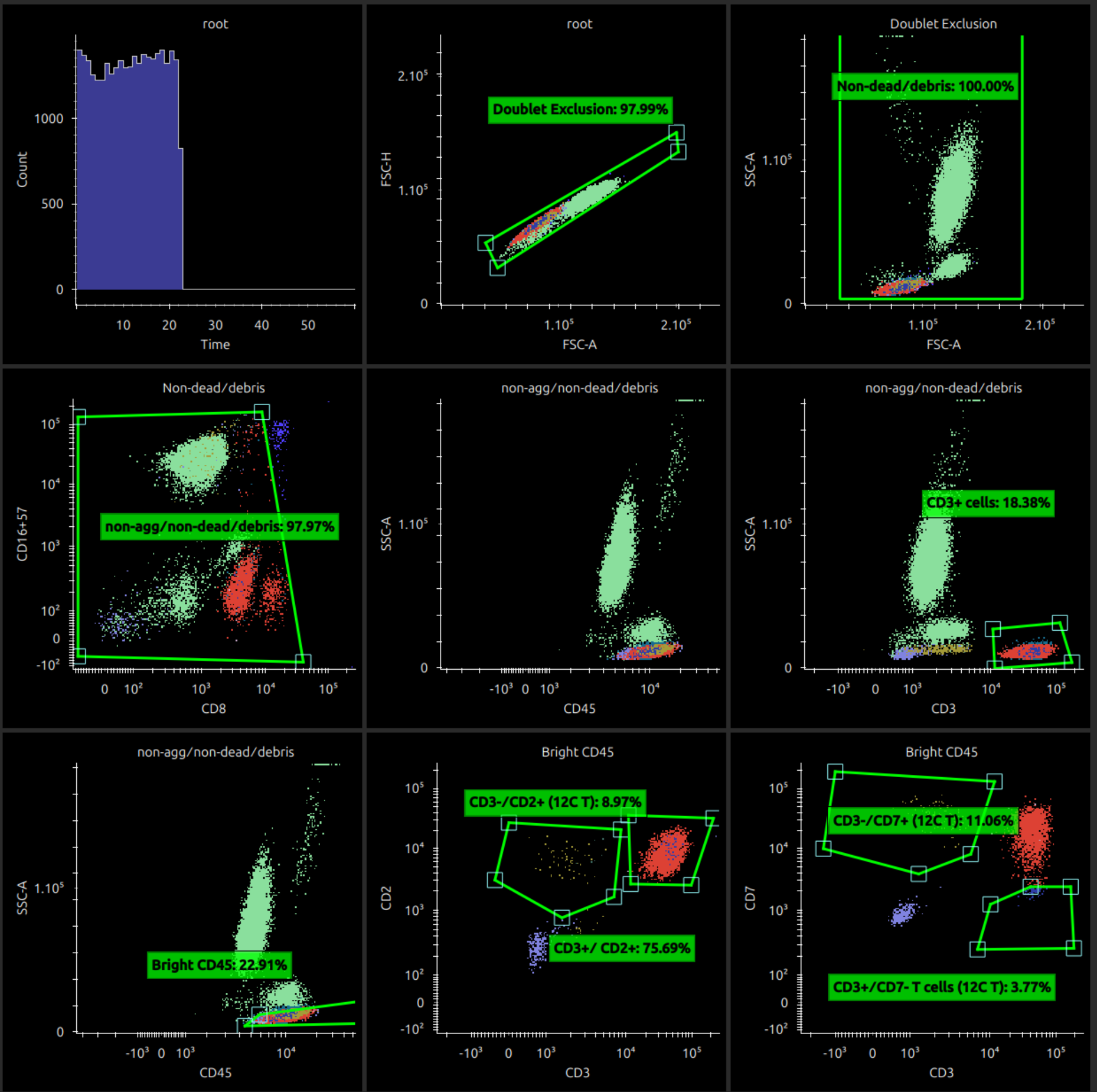
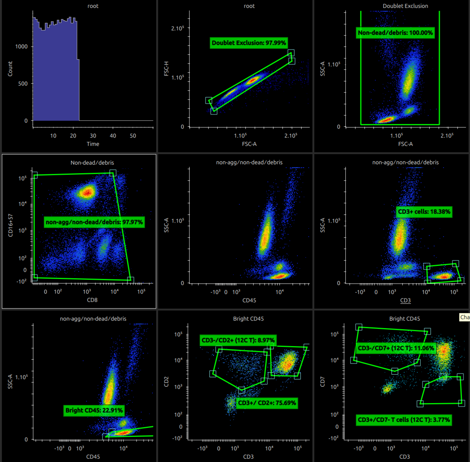
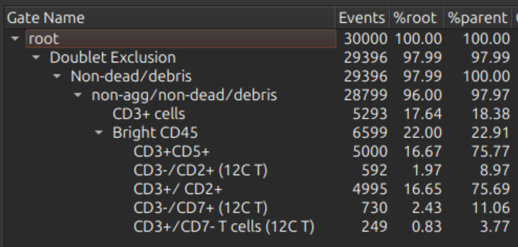
The screenshot below shows an example of some immunology data.
If a plot is selected, the middle part of the menu bar shows controls to move the selected plot (to start, left, right, to end).

The gating hierarchy (if gating hierarchy toggle is on) is shown on the right.
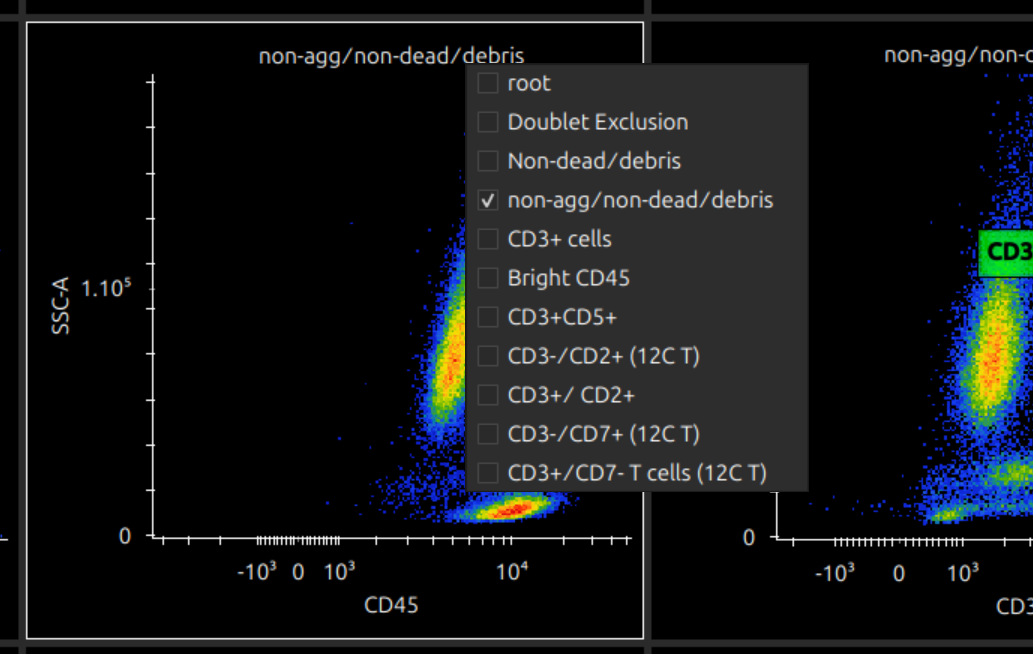
Choose channels and source gate, choose and adjust transforms
On a cytometry plot, click the axes titles or plot title to show a menu of the channels and source gates respectively. (Note that this is restricted if gates are already defined on this plot.)
Selecting “Count” on the Y-axis makes a plot into a 1D histogram. Selecting “All Fluorescence” on the X-axis makes it into a ribbon plot.
Right click on an axis to change its transform (linear / log / logicle). Drag an axis scale near the top end to adjust the full range or near the bottom end to adjust the linear region (for logicle plots).
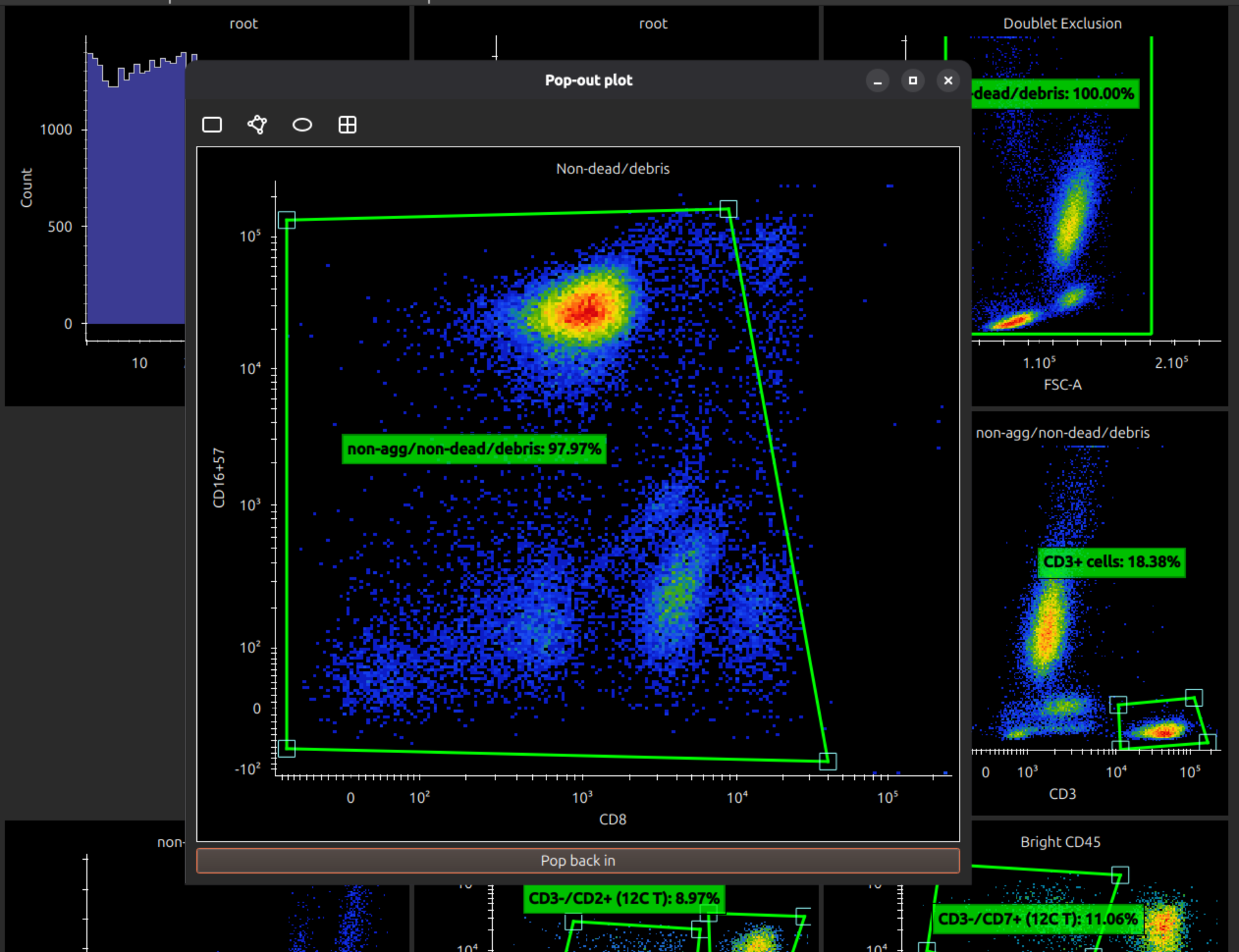
Pop out plots
To work with a plot, if it is too small to manipulate gates accurately, you can double click to pop it out into its own window. (Closing the window pops it back in.)
Add and manipulate gates
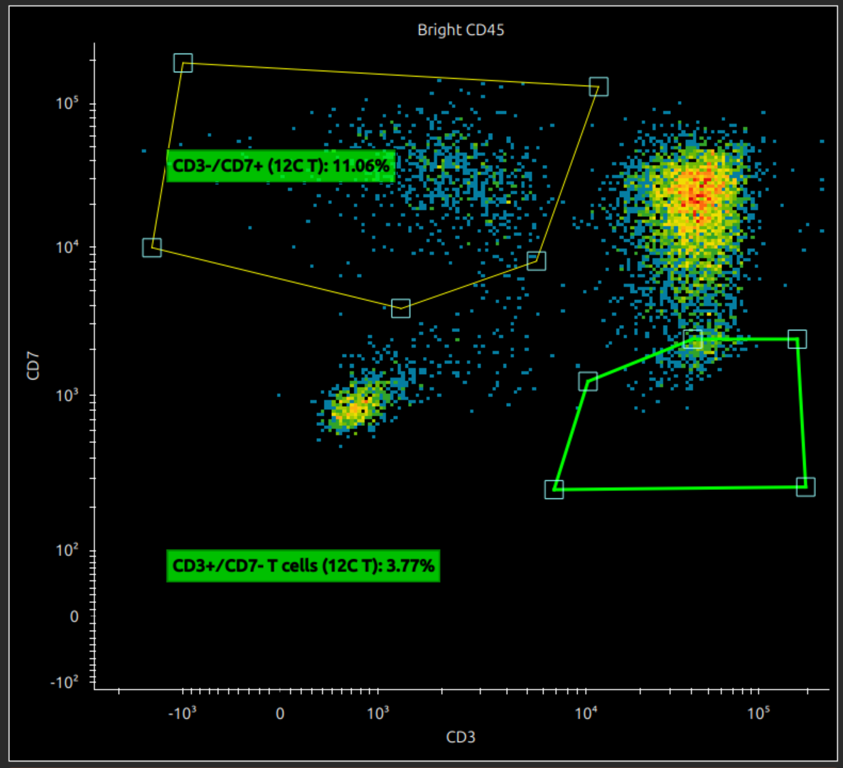
If a 2D plot is selected, the menu bar shows icons to create a rectangle gate, polygon gate, ellipse gate or quadrant gates.

If a 1D plot is selected, the menu bar shows icons to create a range gate only.

If you hover over a gate (or a line, or a vertex on a polygon gate), the highlighting shows what it is selected, whether it is the entire gate, a vertex or line. You can do the following with polygon gates:
- click on a line to add a vertex (if a line is highlighted)
- right click on a vertex to have the option of removing it (if vertex selected)
- drag the whole gate (if the whole gate is highlighted)
Also drag the gate title to move the label or double click to rename.
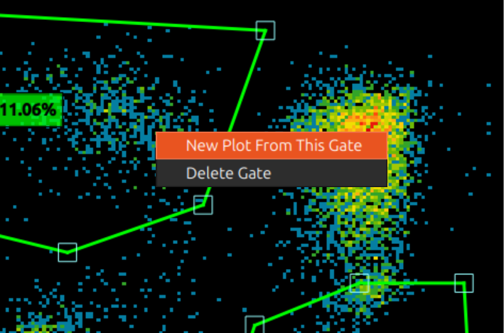
Right click a gate to bring up a menu: you can create a new plot with this as source gate, or delete the gate.
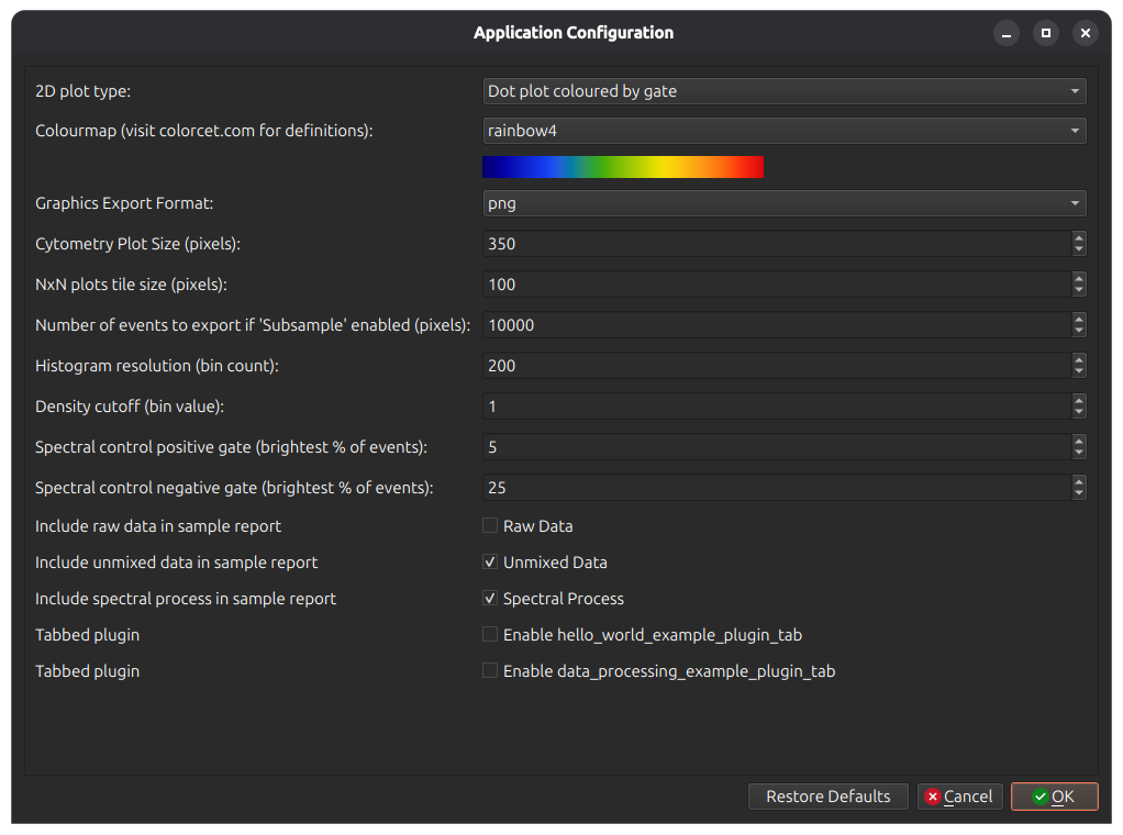
Dotplots coloured by gate, and other options
In menu Edit > App Configuration, there are several useful options for cytometry plots. Among them you can select the colourmap, size of plots, etc.
On the first option 2D plot type, select Dot Plot Coloured by Gate. This reloads the main window to show coloured dotplots.