Cytkit | Honeychrome
 Honeychrome
- Overview and Installation
- Acquire Data
- Spectral Analysis
- AutoSpectral in Honeychrome
- Conventional Analysis
- Manipulate Plots and Gates
- Reports, Exports & Sample Comparison
- Programming and Plugins
Reports, Exports & Sample Comparison
This guide assumes you have already done the following:
- installed Honeychrome using the executable installers (Windows/Mac/Linux) or Python (cross-platform)
- followed at least one of the following examples
- Spectral Analysis
- Conventional Analysis
- set up plots and gates in the unmixed data.
From the unmixed cytometry, Honeychome can:
- generate a sample report
- export individual figures
- export unmixed FCS files,
- generate statistical comparisons between samples, as a:
- bar chart
- box and whisker chart
- 1D histogram overlay
Sample Report
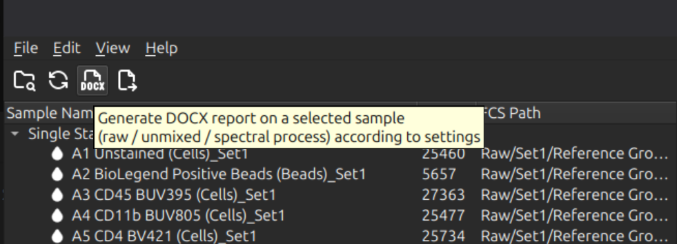
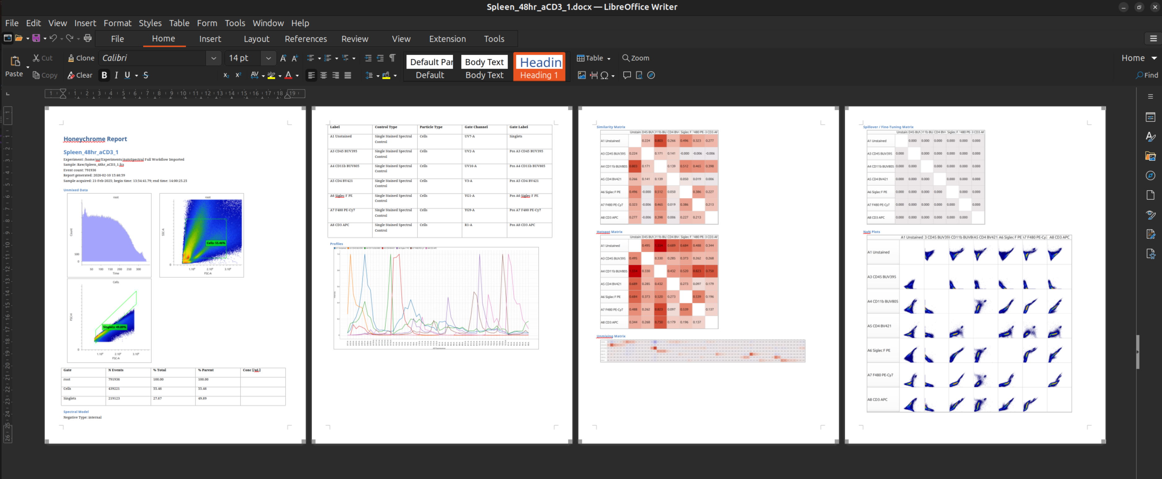
With a sample selected in the sample browser (left pane), click on the “DOCX” button to generate a sample report in DOCX format (or select File menu > Generate Sample Report). The sample report may optionally contain a summary of the raw cytometry data, spectral process and unmixed cytometry data for that sample. (Default is unmixed data and spectral process: see menu Edit > App Configuration.)
The DOCX is saved to the Reports subfolder of the experiment folder. The folder hierarchy of the Reports subfolder mirrors that of the Raw data files.
From the report, figures and tables may be copied and pasted into other documents using a word processor.
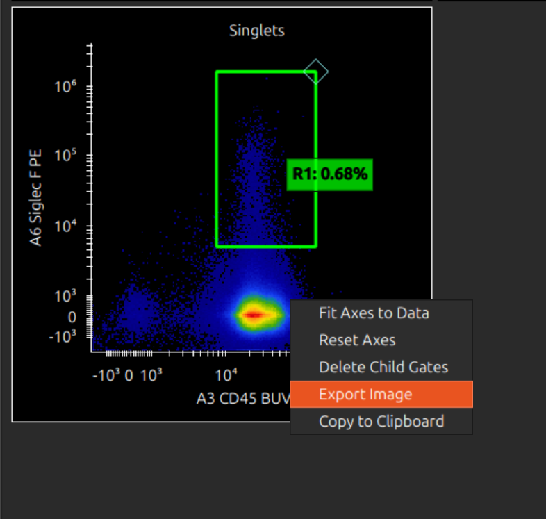
Export Plot / Copy to Clipboard
Right click on an individual plot to copy to clipboard / export to a PNG file.
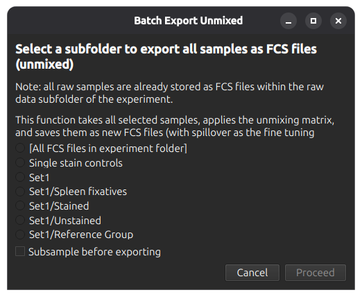
Export Unmixed FCS Files
The batch export function (menu bar or File menu > Batch Export FCS) allows export of a set of FCS files (organised by subfolder). Samples may optionally be subsampled (default: 10,000 events, configurable in menu File > App Configuration).
Statistical Comparison of Samples
Statistical comparison functions are available in the Statistics tab.
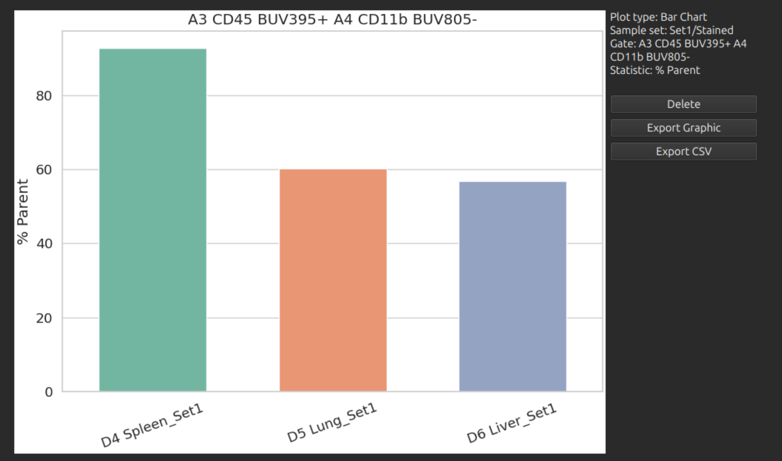
Bar Chart / Box and Whisker Chart
Select any sample set / gate / statistic to produce a bar chart or box-and-whisker chart as follows:

The following statistics are available:
- % Total Events
- % Parent
- Number of Events
- Mean Intensity (in any channel)
A box-and-whisker chart compares folders of samples: each subfolder is treated a group, and each sample within it is treated as a repeat:
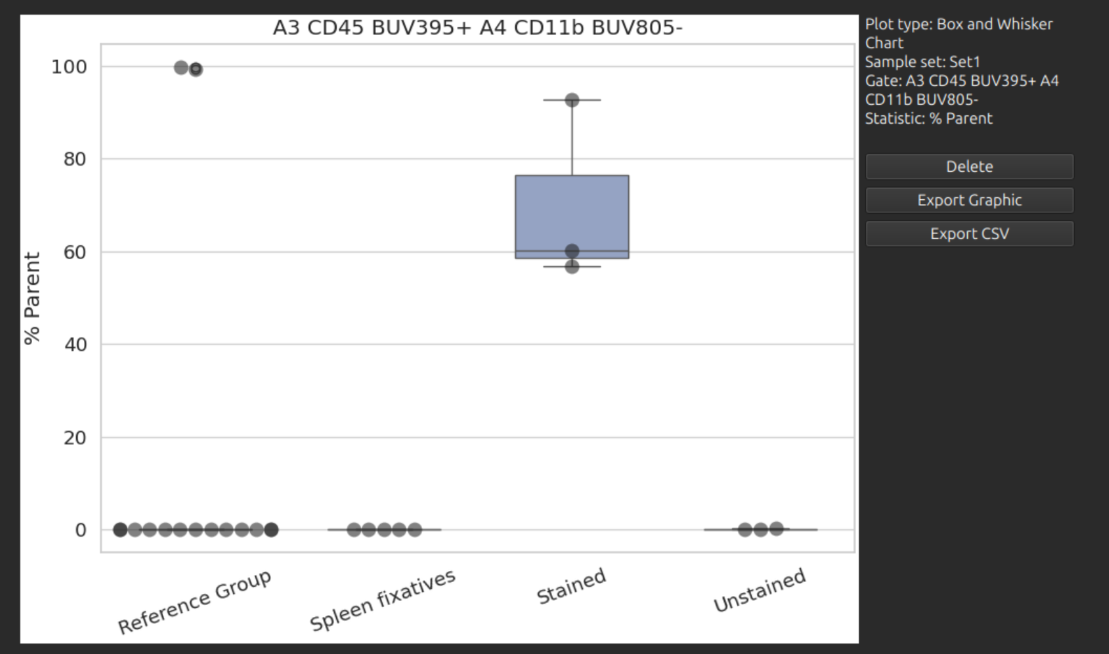
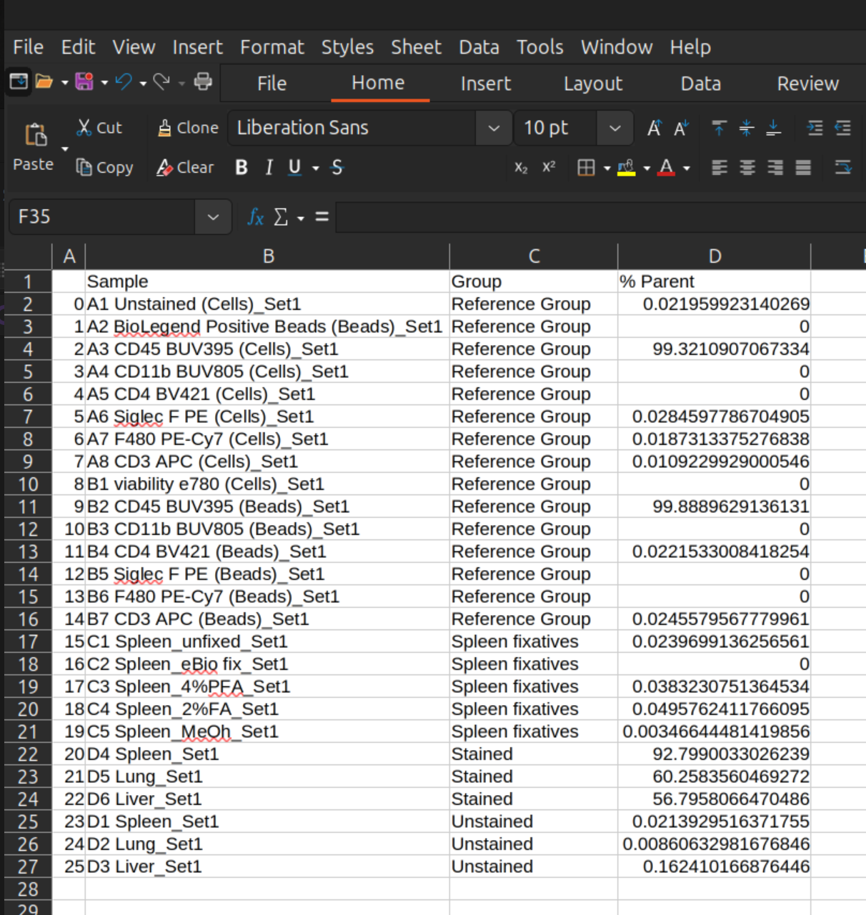
Data can be exported from these plots as an image or CSV file for inspection and plotting in a spreadsheet:
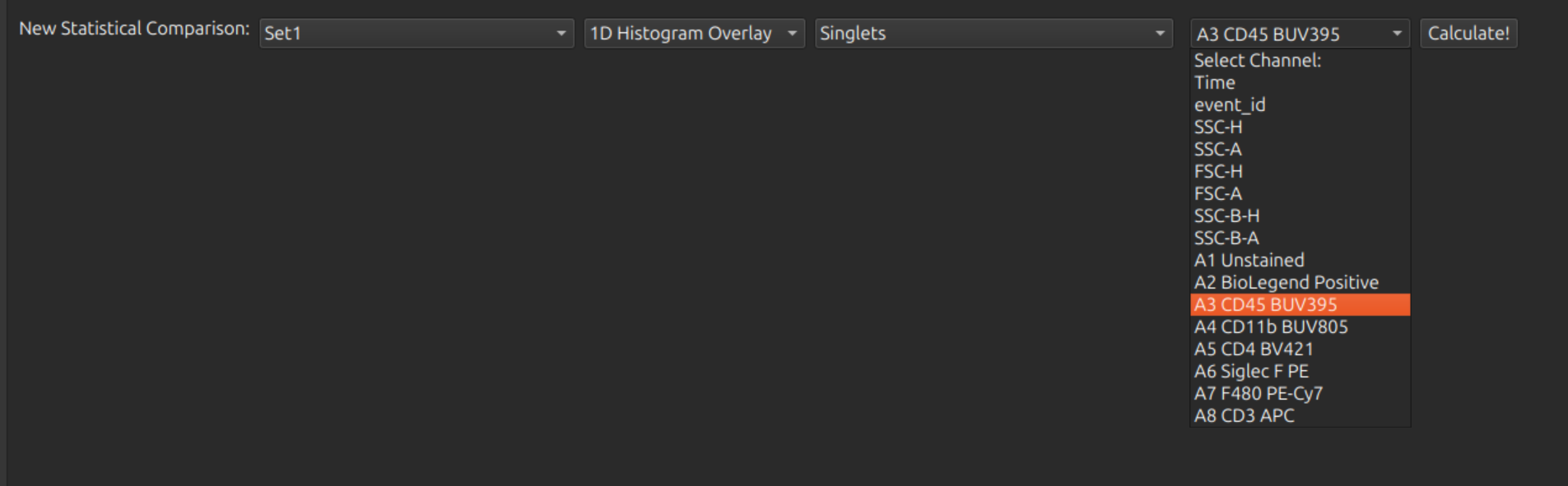
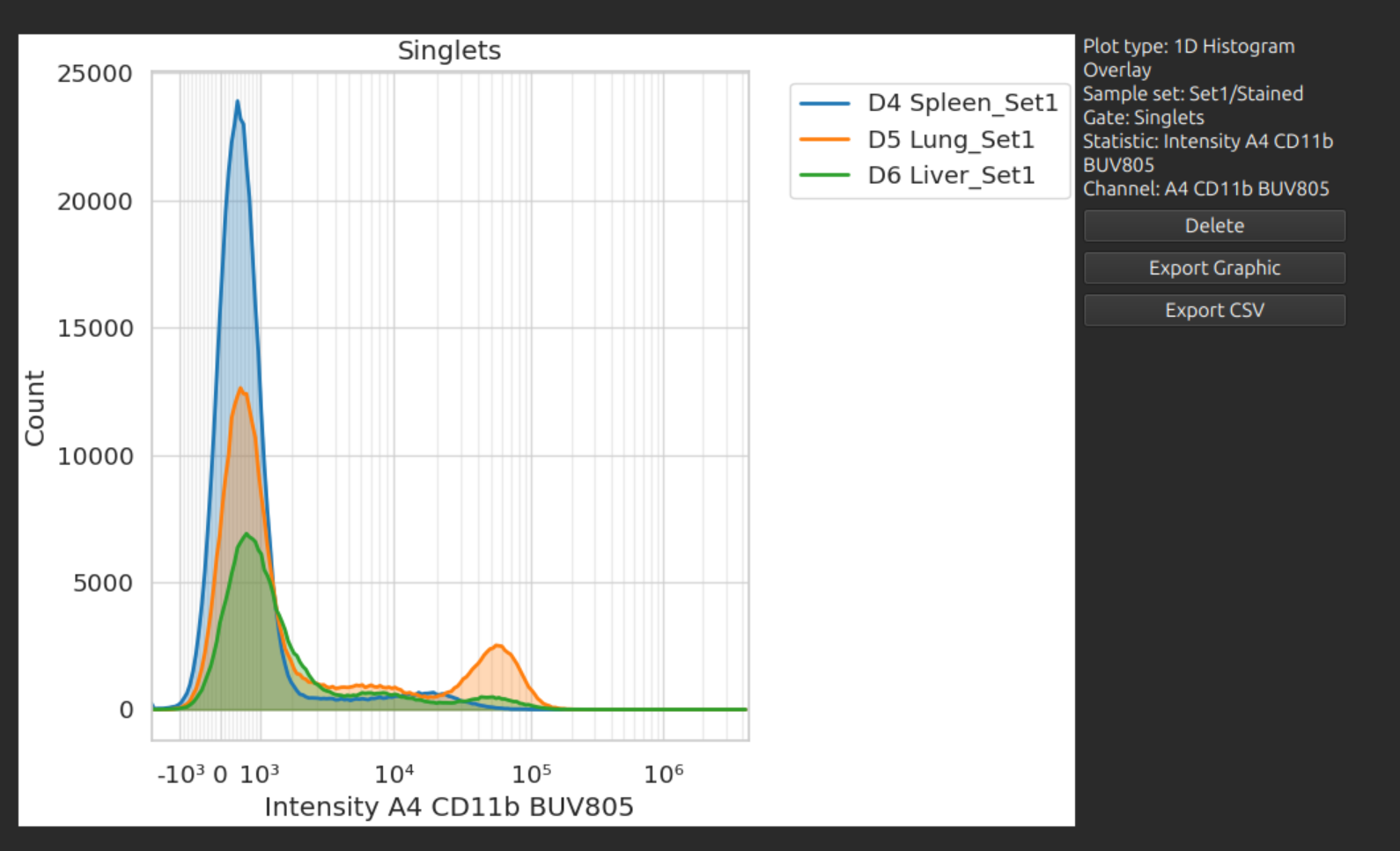
1D Histogram Overlay
Select any sample set / gate / channel to produce a 1D histogram overlay comparison as follows.